
Are you on a position where you are trying to choose a template for your project but wondering which one to pickup. There are thousands of Website template which are available online but when you get down to choose the right one you get confused. The following are a few things that I believe would help you take a decision.
Match your content with the Template.
Basically when you are choosing a website content plays and important role. Usually what happens is that the templates which are sold online have a lot of attractive images, banners and logos used. But they act only as place holders for the content. usually when you try replacing the dummy content of the template with your own content. You may find that the template starts losing its attractiveness.
Also the readymade templates which are available online have a lot of modules and sections which you might not need in your original project. And these dummy content adds a sense of completeness. In your case your might not have the same sections or might have difference in the type or possibly a variation. So you might have to remove these sections.
Any premade template can never match your exact requirement and would surely involve some custom work to be done. But it is important that you find the closest suitable match to avoid additional custom work.
To start with you can try to see what content and images you have and try placing them on template. There are times that your logo might just not match the color theme or might look good only on a bigger area rather than which is available on the template you choose.
To experiment and see how the template might look with your content. You can use the following methods.
Try the template in Image Editor
The Idea here is quite simple, take a screenshot and place it into an image editor and try to use your own logo and hero images to overlap the original and see how well it appears.
Use Browsers Inspect Element to Modify the textual content.
You can use browser tools such as Inspect Element window and try replacing text. Punchlines and descriptions to see how they appear. You can also easily remove a few unwanted demo sections to see how the final output remains.
Look for right Navigation.
Navigation is the most crucial aspect of any website. The ideas behind navigation is simple. It should tell the user of what all is available on the website giving choices to the user. Few options are easier to handle. But when you website is complex it can become very tricky on how to put these up and design plays an important role.
While you are choosing a template based on your requirement see how the template navigation matches your need.
Make a list of menus and arrange them in order of priority and then see which menu fits best your need.
Here are a few Menu types which are available.
- Top Navigation.
- Simple Menus.
- Menus with Dropdowns.
- Mega Menus.
- Sticky Navigation
- Hamburger Menus.
- Block with Image Navigation.
- Side Navigation.
- Slidedown Navigation.
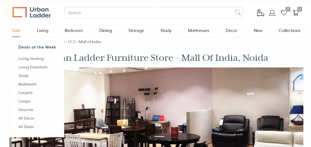
Simple Menus
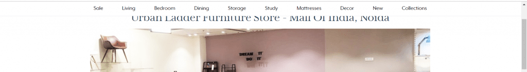
Simple menus are the most common form of navigation. Mostly the website which are around have these. They are usually placed on top and support anything around 5-10 top level menus. Here is an example

When you have options between 5-9 this type of navigation is well suited. For the users its most comfortable to use. So if you website targets older people I would recommend you use this navigation. Because anything fancy would make it difficult for the users to figure out.
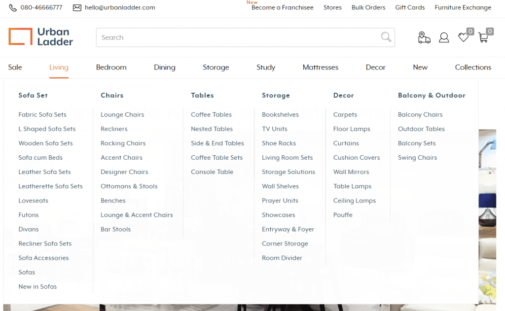
Simple Menus with Dropdowns.
Simple menus with dropdowns is again very common. They just have a dropdown list which comes up when you hover or you click on the item.
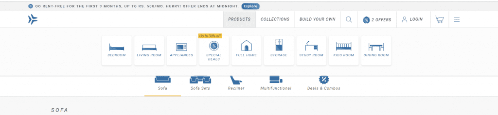
Mega Menus
Mega menus are quite common with website selling products. these menus usually have pictures which make them attractive. But they can also be just textual like as in the example below.
These are best when you want the users to choose from a big range and user is very clear about what he is looking from.
There can be many variations to this style. Like below the website has added icons.
Sticky Navigations
Sticky Navigations are those which do not hide or scroll up when you scroll the page. The kind of stick when you scroll the page. These are helpful when you give a long page to scroll. But also they eat up a small portion always.
There is a variation of this model which hides when we scroll down but just as we start scrolling up it appears back. You can check out an example here.
https://www.w3schools.com/howto/howto_js_navbar_hide_scroll.asp
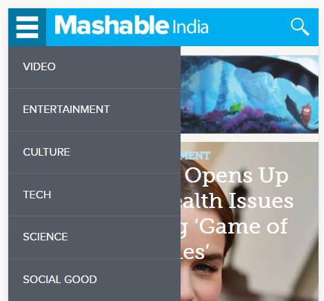
Hamburger Menus.
Hamburger menus are usually used on smaller devices because it is not possible to always display the menu as they take up space. Hamburger menus help the user to navigate.
There are many ways a menu adapts itself in the smaller devices. But it is important for you to choose which menu suits your website better.
Side Menus
Side menus is a great way to navigate. They are very successful for website which are for documentation and have a huge no of topics to cover.
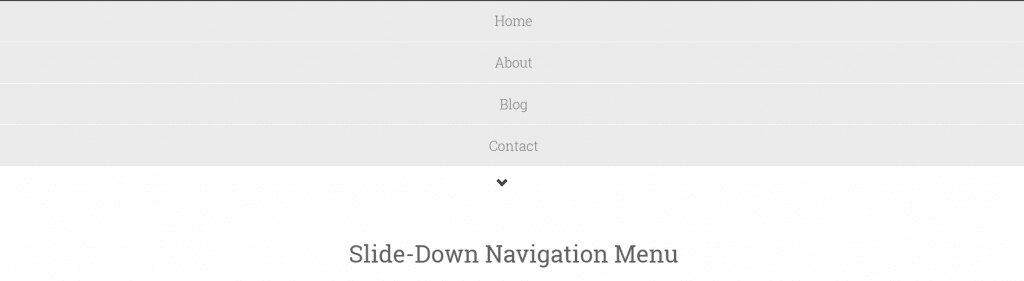
Slidedown Navigation.

Slide down navigation has a small arrow button. But can also include text to describe it more. When user click the button the menu appears as shown below with a sliding effect.
If your options fit well and the targeted audience can use it well then your are on the right path.
Readability
Readability play an important role for any website. Make sure whatever template you use has a good readable font. Apart from right contrast it is also important to see the font size used.
The text should be easy on eyes to read and the background should not be too sharp or too flash.
Leave a Reply
You must be logged in to post a comment.