
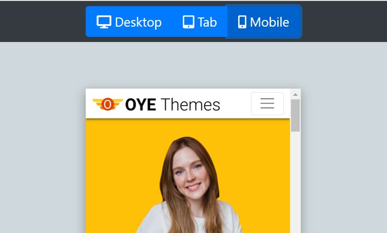
Tool in Action
Try the tool first!
Story behind the tool.
I am working with my team on OyeThemes.com. The project is all about HTML Templates and smaller blocks that can be downloaded by our users.
Oyethemes.com is still under development and very soon it would be online. There would be a lot of templates for smaller sections such as Pricing Table, Feature List etc. for free use.
We thought that Mobile, Tab & Desktop previews on the page itself would be a good idea. It will boost their confidence in using the templates we have. Afterall Responsive design is very important when we choose any template.
For this, the idea we borrowed is quite common. There would be three buttons for mobile, tab and desktop. On clicking these button the preview area will expand or contract to the respective sizes.
Built Using
It was so much fun to create this small tool, built with simple jQuery and CSS.
I also used bootstrap and font awesome icons. But these are replaceable.
How it works.
We create an Iframe and then we load our Template URL into it. Now once we have done this it’s only a matter of resizing the Iframe with the help of CSS and Javascript.
When we click the mobile button we set the size of Iframe to 335px X 495px. Using the following code.
$("#mobileview").click(function(){
	$("#iwindow").css("width","335px");
	$("#iwindow").css("height","495px");
});
The same logic is used for other views. The code is very simple and you will surely understand it at a single glance.
The Code Itself.
The example that we see in the video above just runs with the following code. You can just copy/paste the following code into a html file and it will run just the same as in Video Demo Above.
<!doctype html>
<html lang="en">
  <head>
    <!-- Required meta tags -->
    <meta charset="utf-8">
    <meta name="viewport" content="width=device-width, initial-scale=1, shrink-to-fit=no">

    <!-- Bootstrap CSS -->
    <link rel="stylesheet" href="https://stackpath.bootstrapcdn.com/bootstrap/4.1.3/css/bootstrap.min.css" integrity="sha384-MCw98/SFnGE8fJT3GXwEOngsV7Zt27NXFoaoApmYm81iuXoPkFOJwJ8ERdknLPMO" crossorigin="anonymous">
    <link rel="stylesheet" href="https://use.fontawesome.com/releases/v5.8.1/css/all.css" integrity="sha384-50oBUHEmvpQ+1lW4y57PTFmhCaXp0ML5d60M1M7uH2+nqUivzIebhndOJK28anvf" crossorigin="anonymous">

    <title>Responsive Preview Toolr</title>
  </head>
  <style>
  	.z-depth-3 {
	  -webkit-box-shadow: 0 8px 17px 2px rgba(0, 0, 0, 0.14), 0 3px 14px 2px rgba(0, 0, 0, 0.12), 0 5px 5px -3px rgba(0, 0, 0, 0.2);
	  box-shadow: 0 8px 17px 2px rgba(0, 0, 0, 0.14), 0 3px 14px 2px rgba(0, 0, 0, 0.12), 0 5px 5px -3px rgba(0, 0, 0, 0.2)
	}
  	.iwincon
  	{
 		position:fixed;
  		top:63px;
  		bottom:0px;
  		right:0px;
  		left:0px;
  		margin:auto;

  	}
  	body{
  		background-color: #CFD8DC;
  	}
  </style>
  <body class="">
    <div class="p-2 bg-dark">
    	<div class="text-center">
	    	<div class="btn-group" role="group">
			  <button id="desktopview" type="button" class="btn-view btn btn-primary btn-lg active"><i class="fas fa-desktop"></i> Desktop </button>
			  <button id="tabview" type="button" class="btn-view btn btn-primary  btn-lg"><i class="fas fa-tablet-alt"></i> Tab </button>
			  <button id="mobileview" type="button" class="btn-view btn btn-primary  btn-lg"><i class="fas fa-mobile-alt"></i> Mobile</button>
			</div>
    	</div>
    </div>
    <section>

	<div id="outer_container" class="iwincon">
		<iframe id="iwindow" class=" z-depth-3" src="https://www.oyethemes.com" frameborder="0" style="width:100%;height:700px;">
	    		<!-- contact-form3 section end-->
	    	</iframe>
	</div>
    </section>


    <!-- Optional JavaScript -->
    <!-- jQuery first, then Popper.js, then Bootstrap JS -->
    <script src="https://code.jquery.com/jquery-3.3.1.slim.min.js" integrity="sha384-q8i/X+965DzO0rT7abK41JStQIAqVgRVzpbzo5smXKp4YfRvH+8abtTE1Pi6jizo" crossorigin="anonymous"></script>
    <script src="https://cdnjs.cloudflare.com/ajax/libs/popper.js/1.14.3/umd/popper.min.js" integrity="sha384-ZMP7rVo3mIykV+2+9J3UJ46jBk0WLaUAdn689aCwoqbBJiSnjAK/l8WvCWPIPm49" crossorigin="anonymous"></script>
    <script src="https://stackpath.bootstrapcdn.com/bootstrap/4.1.3/js/bootstrap.min.js" integrity="sha384-ChfqqxuZUCnJSK3+MXmPNIyE6ZbWh2IMqE241rYiqJxyMiZ6OW/JmZQ5stwEULTy" crossorigin="anonymous"></script>

	<script>
		$(document).ready(function(){

			$("#mobileview").click(function(){
				$("#iwindow").css("width","335px");
				$("#iwindow").css("height","495px");
				$("#outer_container").addClass("d-flex justify-content-center align-items-center");
				$(".btn-view").removeClass("active");
				$("#mobileview").addClass("active");

			});

			$("#tabview").click(function(){
				$("#iwindow").css("width","783px");
				$("#iwindow").css("height","100%");
				$("#outer_container").addClass("d-flex justify-content-center align-items-center");
				$(".btn-view").removeClass("active");
				$("#tabview").addClass("active");
			});


			$("#desktopview").click(function(){
				$("#iwindow").css("width","100%");
				$("#iwindow").css("height","100%");
				$("#outer_container").removeClass("d-flex justify-content-center align-items-center");
				$(".btn-view").removeClass("active");
				$("#desktopview").addClass("active");
			});
		});
	</script>

  </body>
</html>t
That’s it!
Leave a Reply
You must be logged in to post a comment.